An app designed in Sketch and prototyped in InVision.
Both iOS and Android versions of the app successfully launched in late summer 2020.
ParPoints has around 1,000 active users as of January 2021.
I create and deploy all marketing emails via MailChimp, to over 1,000 subscribers, with custom graphics and animations to engage viewers and entice clicks.
Designed 10+ merchandise items for the ParPoints e-commerce shop.
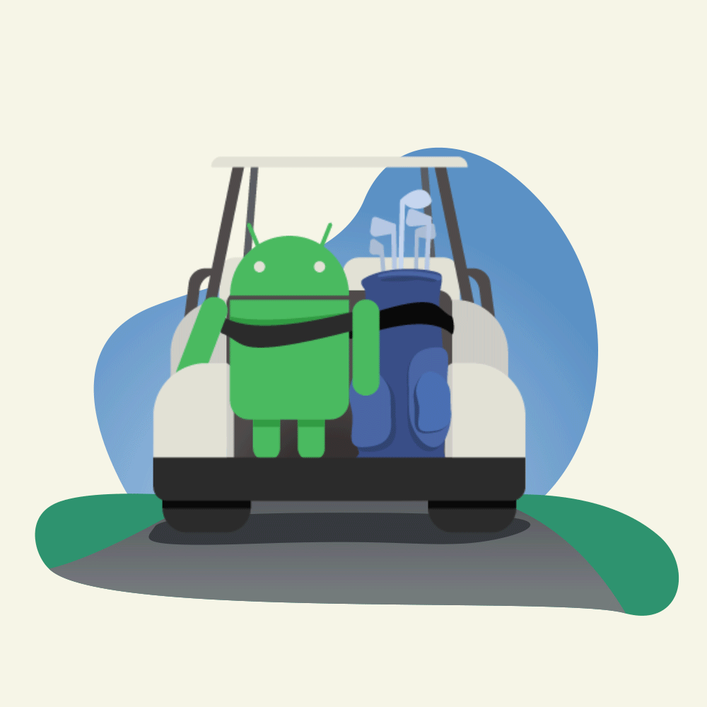
Are you a golfer? The ParPoints Golf app is for you. Not a golfer? The ParPoints Golf app is for you, too.
A couple years ago, my brother-in-law and his business partner came up with a new concept for scoring a round of golf: a points system based not only on how many strokes you use to get into the hole, but also taking into consideration how far away you started. That way, beginners could experience the satisfaction of shooting par, without being restricted to starting a hole from hundreds of yards away. Plus, as we discovered during our testing, experienced (read: good) golfers have a blast using ParPoints as well, as it gives them a new type of game to play on their old, familiar courses.
Anyway, my brother-in-law approached me with this concept, and I was all in as their design guy. I started by creating the brand you see below (and can see on the ParPoints website), which playfully dangles two interlocking Ps that are shaped like golf irons. That mark is now proudly splashed on hats, shirts, pullovers, and, naturally, on Insta.
From there, it was time to, you know, actually design the app. So I pulled up Sketch and got to work. Beyond the explicit aesthetic set by my brand work, I went into the app design project with two very clear self-imposed parameters in mind:
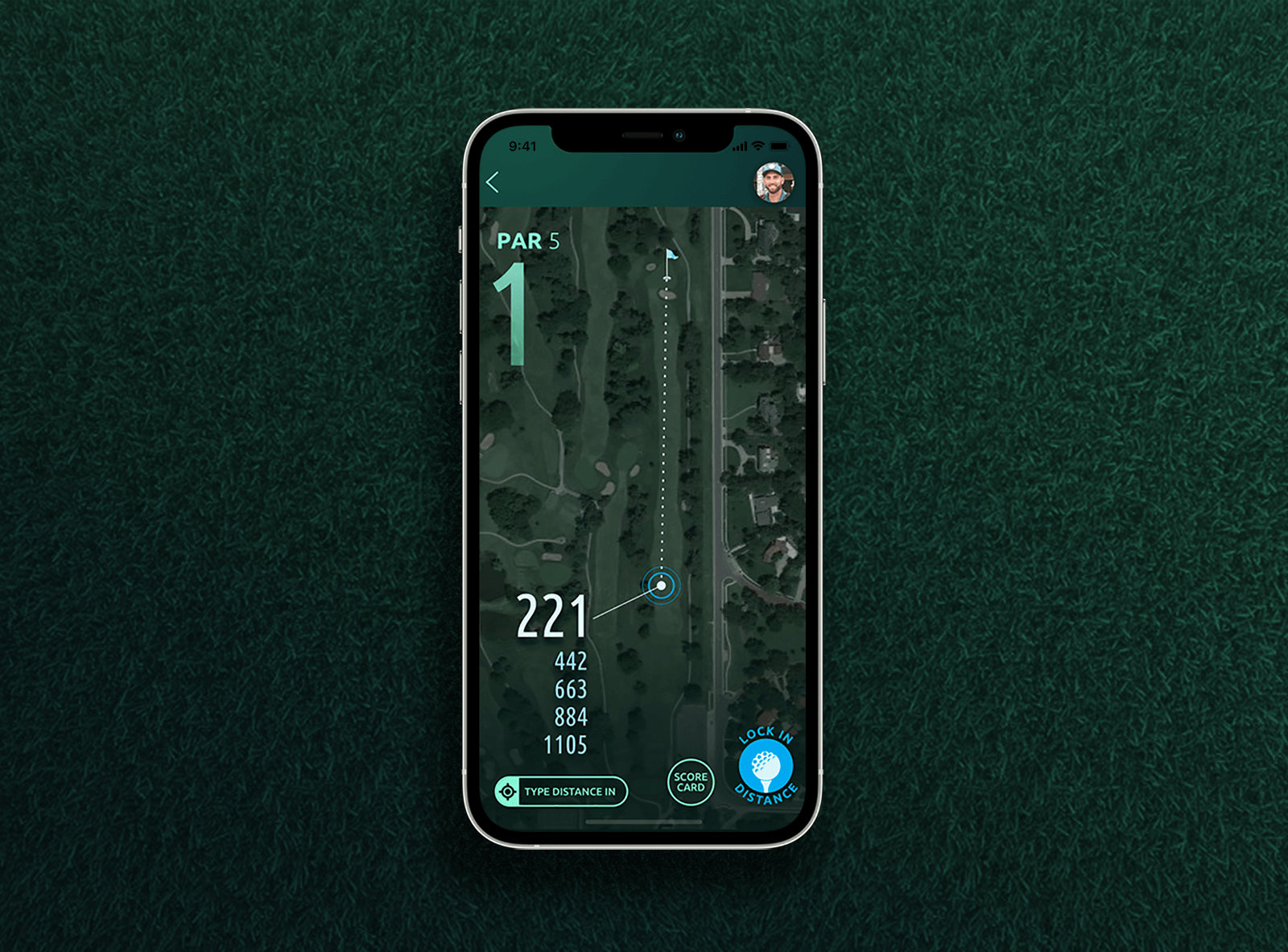
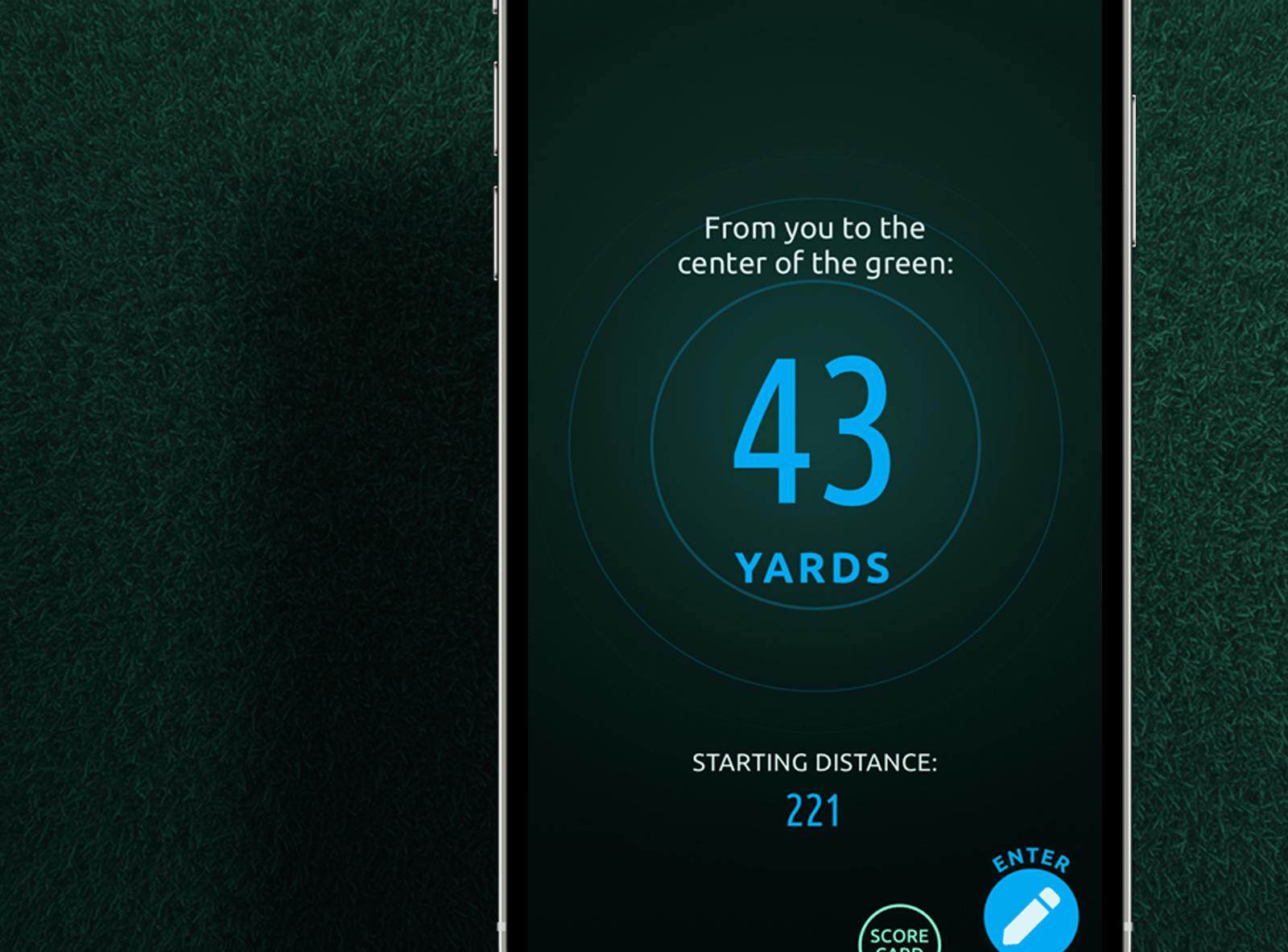
Keep the designs—all of them—dark in color. Nothing would kill the usefulness of the app faster than the app killing users' phone batteries over the course of a three-hour round of golf.
Keep primary action buttons in the bottom right, with a very sequential flow that can be navigated by single clicks on those lower-right calls to action. You're on a golf course, it's hot, your hands are sweaty, and one of them is probably gloved. You don't want to be messing with your phone, scrolling and trying to tap all over the place. Pull your phone out of your pocket, hold it with one hand, tap a button with your thumb, and back in your pocket the phone goes. Boom.
From there, user personas and their associated use-cases dictated the actual screens needed; and at last count, there are about 35 screens that I've designed. The Sketch designs became InVision prototypes, which became a real, live app, thanks to the help of a third party development shop.
There were several false starts coming up with the logo concept, but once it struck me that a golf iron could believably serve as the letter P, the rest fell into place like magic.
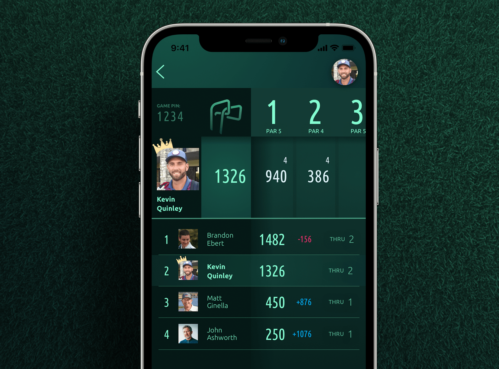
As we add features over time, I've kept laser-like focus on the core aspect of our gameplay: the scoring system. Data is presented in an easy-to-navigate layout, while not straying from the brand aesthetic.
Dark, dark, dark. Especially for screens like this rangefinder that gives you your current GPS distance remaining to the hole—you may have this screen up in front of you for a bit, so let's not make your phone work too hard to display it.
What's the point of designing graphics for emails if you can't have a little fun with them?
The app's launch was a bigger success than we ever dreamed. Players are playing it, and then coming back out and playing it again. The feedback we're getting has been overwhelmingly positive.
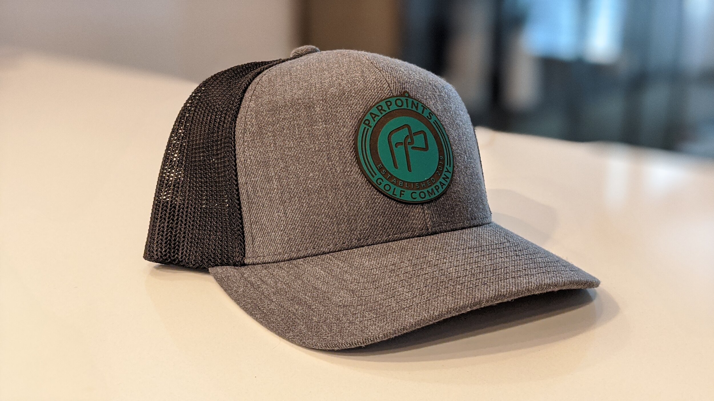
You can't design a golf brand that doesn't look good on a hat. Just can't do it. So I didn't. And now we've already sold a bunch of these puppies.