From the global nav all the way to the footer, every section was designed as a reusable component with a custom layout based on available content.
Small animations engage the user as they navigate and scroll, keeping their interest fixed.
Layouts were created with mobile in mind, based on analytics of site traffic and trends.
Online sales for the client are up big-time since the new site launched.
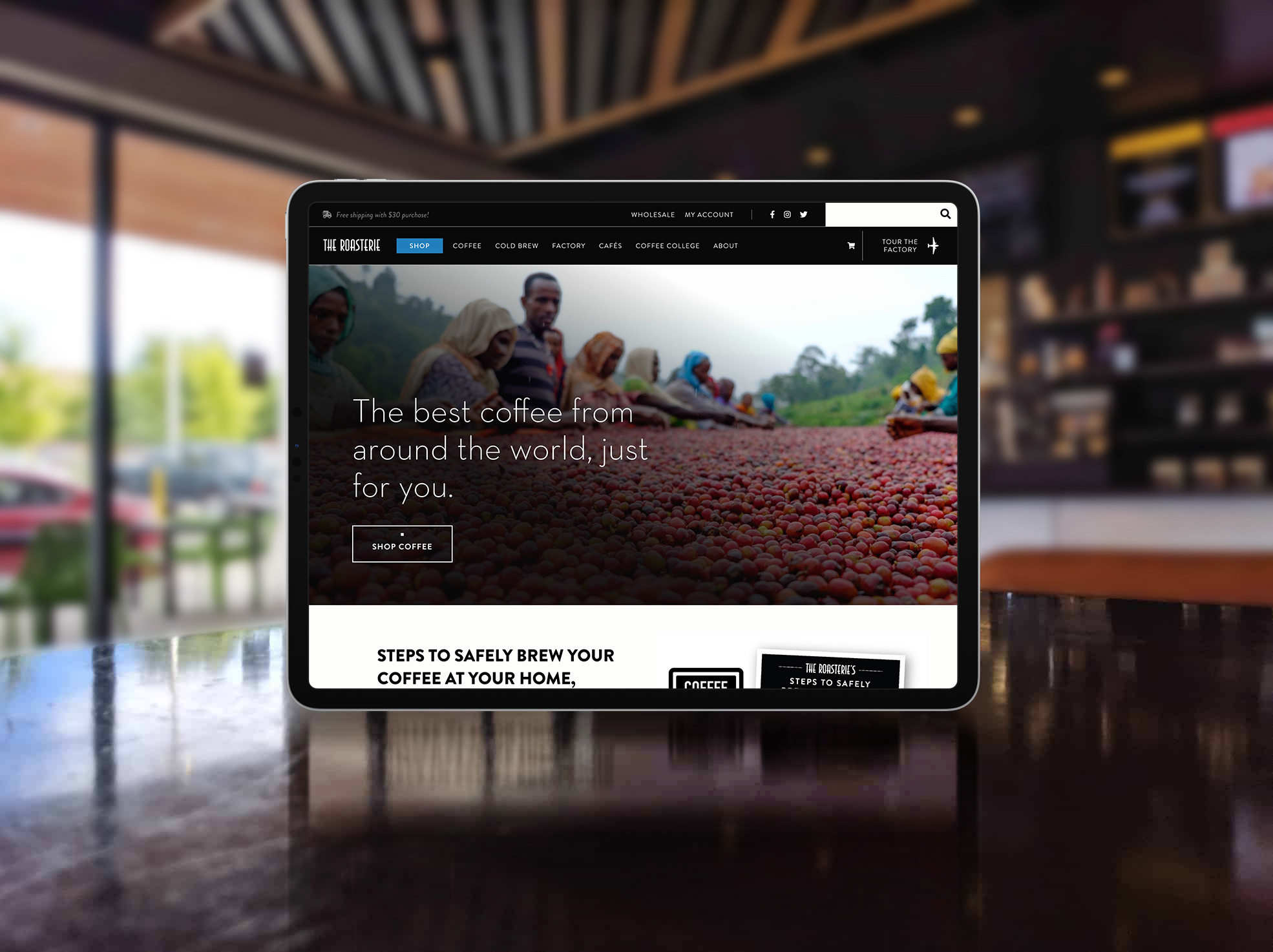
A Kansas City institution known for its local cafes, roasting factory tours, and a giant airplane bolted to its exterior, seemingly ready to take flight at any moment, The Roasterie is a pretty darn cool brand. But until early 2019, it was rocking a pretty darn awful website. Think burlap sack backgrounds, image sliders embedded in iFrames, navigation that changed depending on what page you were on—the works.
So MAKE Digital participated in and won the RFP for its rebuild, and I was fortunate enough to get to design and build the front-end of the site myself.
I approached the project with particular care and attention to The Roasterie's freshly revamped brand aesthetic—created by the wildly talented Lynne Pierce—holding meetings with stakeholders in Roasterie cafes and the factory itself. From the ground up, I designed the site to digitally radiate the feel of physical Roasterie properties and products. A crisp black and white palette is pervasive throughout, and the layout was structured to very intentionally showcase the content within.
The old site represented coffee as a dirty old bean. The new site represents coffee as a lifestyle.
The UI was engineered from every vantage point to drive users where the client really wants them to go: the Shop page. Once there, they'll see a clean, straightforward layout that makes buying a breeze.

When I say everything was custom, I mean everything—right down to the animated interaction users have with the site menu on mobile.

The Roasterie's official brand colors are black and white. I'm not being figurative; their colors are literally #000000 and #FFFFFF. But they do incorporate a new blue color to shoot materials through with a little whimsy now and then, so I too picked my spots to break up the monotone palette—which I do love, admittedly (look around you right now).

The client was very attentive to the importance of the global navigation for such a massive e-commerce site. We sat down—at a Roasterie cafe in KC—and dedicated a whole spitball-and-sketch session to the nav alone.

A subtle little animation way down in the footer? Who does that? Me, that's who. I'm tellin' you: delight in the little details, it makes all the difference.